website redesign
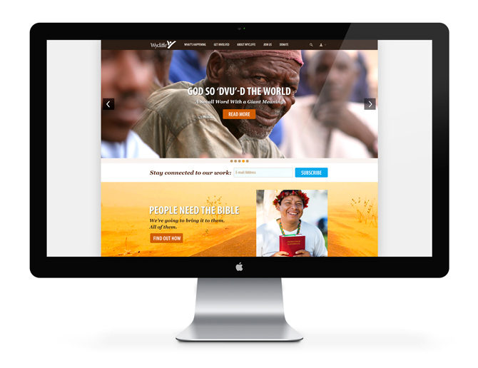
When Wycliffe Bible Translators hired an outside vendor to redesign and develop their website, my role was to provide subtle art direction for the organization’s brand. However, the vendor’s initial design for the site didn’t quite hit the mark and my leadership asked that I provide more specific thought and design for the site.
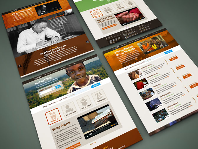
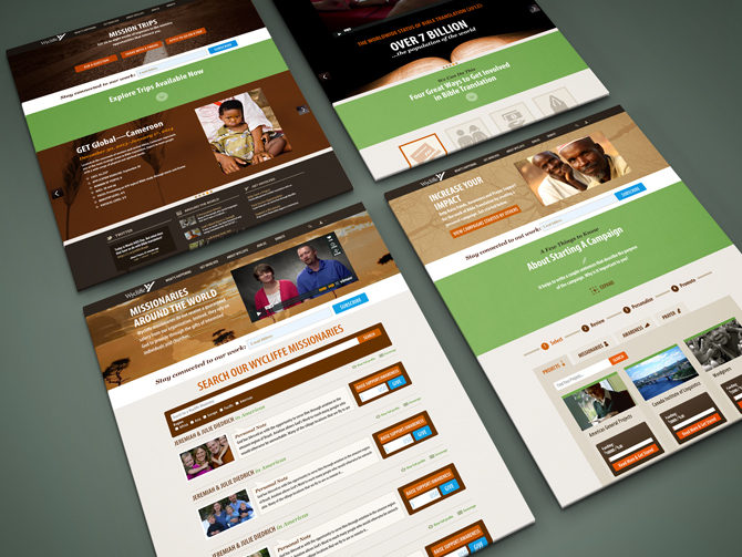
In doing so I redesigned or restyled of each of the pages, which facilitated deeper discussion between myself, the site vendor and Wycliffe’s key stakeholders.
A few of the updates I proposed were:
- The use of consistent layout structures for the secondary and tertiary pages, as much as possible based on the content.
- Streamlining the use of color, particularly in links and buttons, proposing a vibrant blue for the call-to-action buttons that asked the user to “give” or “subscribe,” and a burnt orange color for buttons that would take a user to another page on the site.
- Typography in line with the Wycliffe brand and consistent in hierarchy and structure.
Today, Wycliffe’s website has morphed and changed as the organization’s brand has transitioned over time. My hope, and belief, is that my process of design thinking created deeper collaboration, communication, and understanding between Wycliffe and the site’s developer.
Roles: Art Direction, Design
CLIENTWycliffe Bible Translators